Design taste is V4’s core breakthrough, and it shows up in every output.
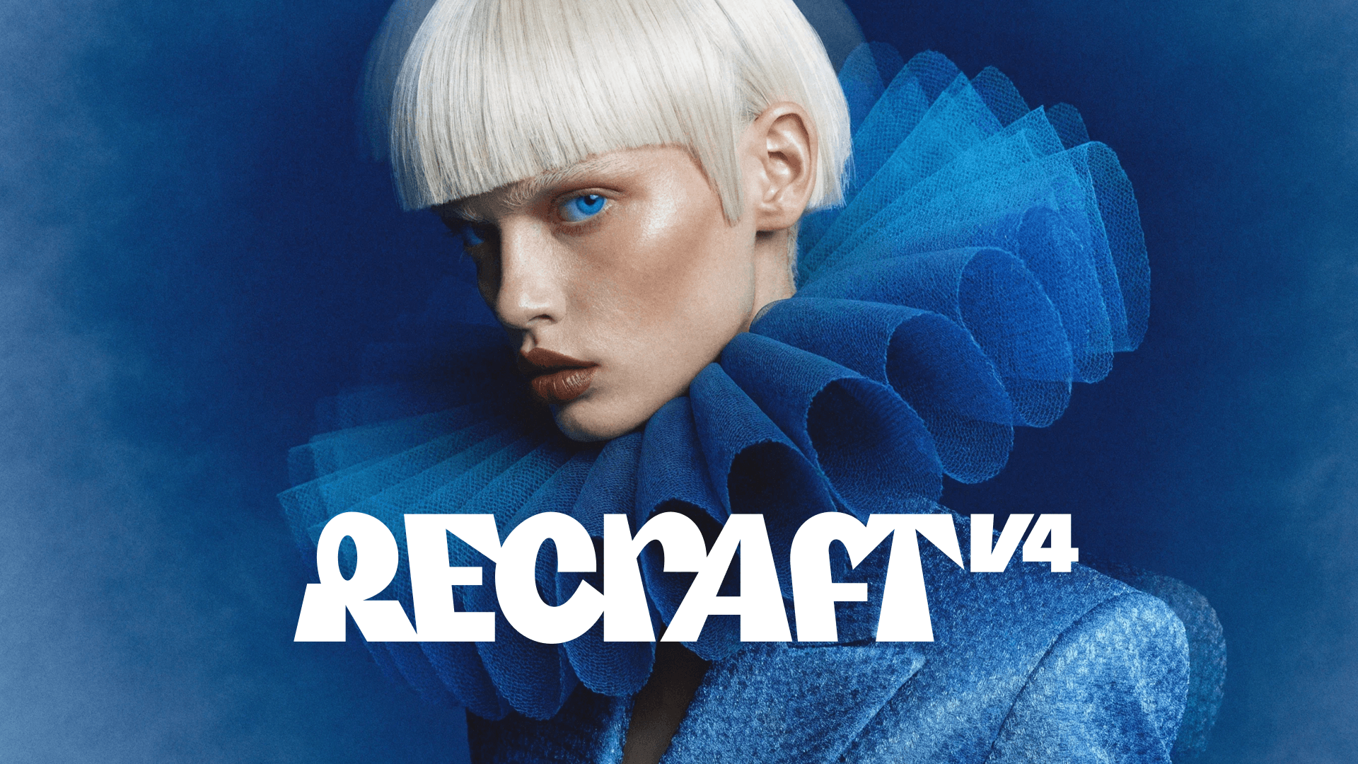
Today we're releasing Recraft V4, our most advanced image generation model. It's a ground-up rebuild focused on the things that actually matter when you're making images for real work: visual taste, prompt accuracy, and output quality that holds up at any size.
Most leading image models today are optimized for broad, general preference. While that works well for mass appeal, it does not always align with the standards required for brand systems, campaigns, and production-ready design work. We developed the model in close collaboration with designers, tuning it around design aesthetics and professional expectations.
The goal was not just accurate prompt interpretation, but stronger visual judgment across composition, lighting, color relationships, and material realism. As a result, Recraft V4 brings true visual taste to AI image generation.
V4 is available in two versions: V4 and V4 Pro. Both models share the same creative capabilities and design taste, and produce the same art-directed, professional visual results. The difference is resolution and scale. V4 is faster and more cost-efficient (~10 seconds, lower cost), making it ideal for everyday work and iteration. V4 Pro generates higher-resolution images for print-ready assets and large-scale use (~28 seconds, higher cost).
Go beyond photorealistic stock with images that feel art-directed
V4 is tuned to make aesthetic decisions about composition, color relationships, and detail hierarchy. The results show balanced composition, cohesive color, and refined detail. When you prompt V4, you're not just getting an image that matches your description. You're getting one where the visual choices — how elements are arranged, how colors interact, where the eye moves — feel intentional.
Here are some examples of photorealistic images generated with Recraft V4 Pro.
This design intent becomes especially clear when you place V4 side by side with other models. To better illustrate the difference, let's compare photorealistic portraits generated with Recraft V4 Pro, Nano Banana Pro, and other trending models.
V4 Pro
Nano Banana Pro
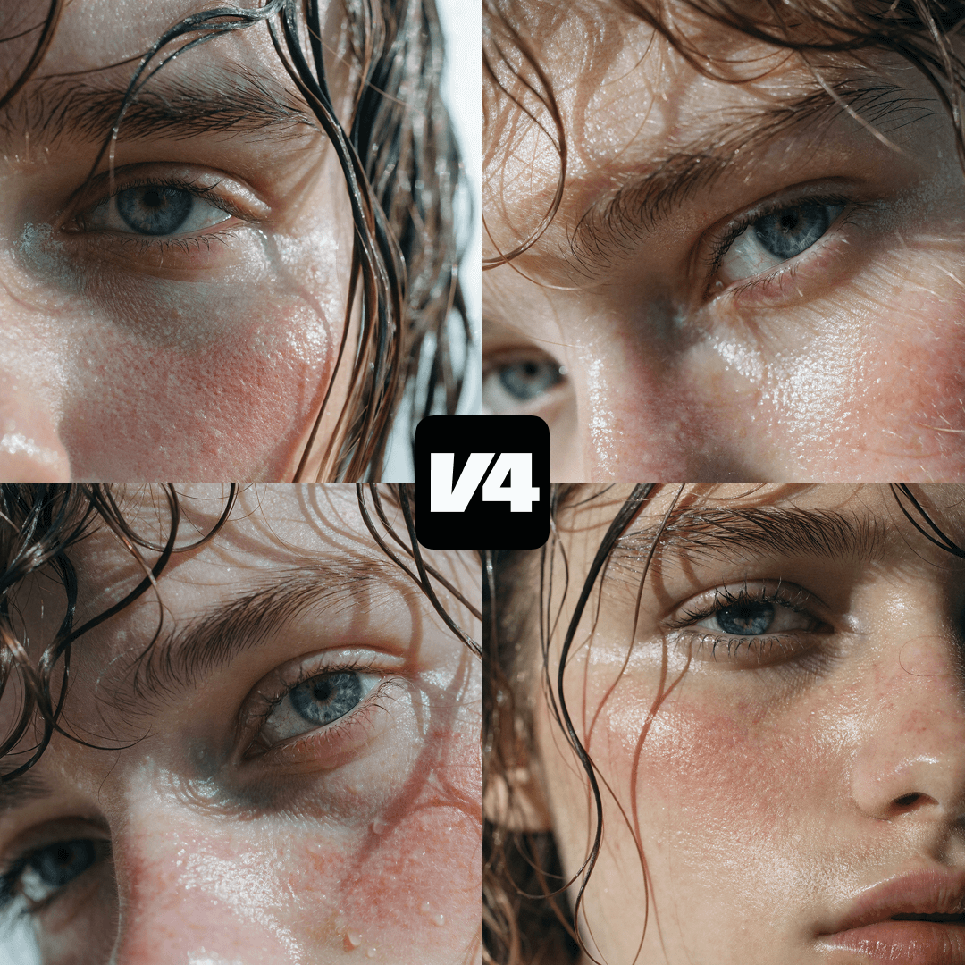
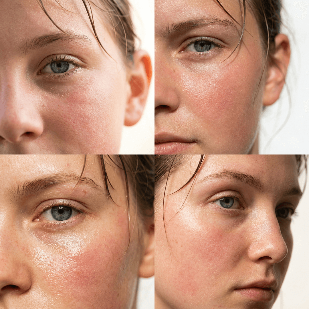
PROMPT (click to expand)
Extreme macro close-up of a young person's face, focusing on one eye and cheek, visible natural skin texture with pores, fine facial hair and soft peach fuzz catching the light, subtle redness and flushed cheek, slightly damp glowing skin, blue-gray eye in sharp focus, relaxed neutral expression, stray wet hair strands falling across forehead and temple, cinematic natural daylight coming from the side, high detail realism, ultra-sharp 100mm macro lens look, shallow depth of field with soft falloff, editorial skincare photography, no heavy retouching, authentic imperfect skin, warm color grading with soft highlights and gentle contrast, minimal background blown out to white, intimate raw beauty aesthetic, hyper-realistic texture detail.
Both models clearly understand the prompt and deliver what's asked: close-up framing, stray wet hair strands, accurate eye color, and clean skin detail. The difference, however, appears in texture and mood. V4 produces cinematic frames with distinct emotional atmosphere. It's not stock. Nano Banana Pro is technically compliant, yet feels less expressive.
Now let's look at some other photorealistic portraits and their prompts.
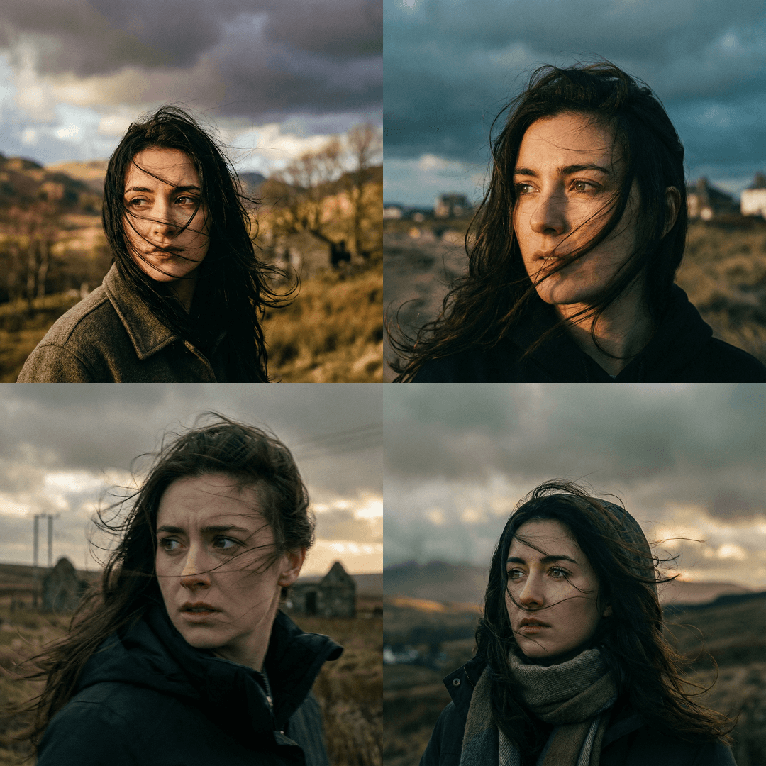
V4 Pro
Nano Banana Pro
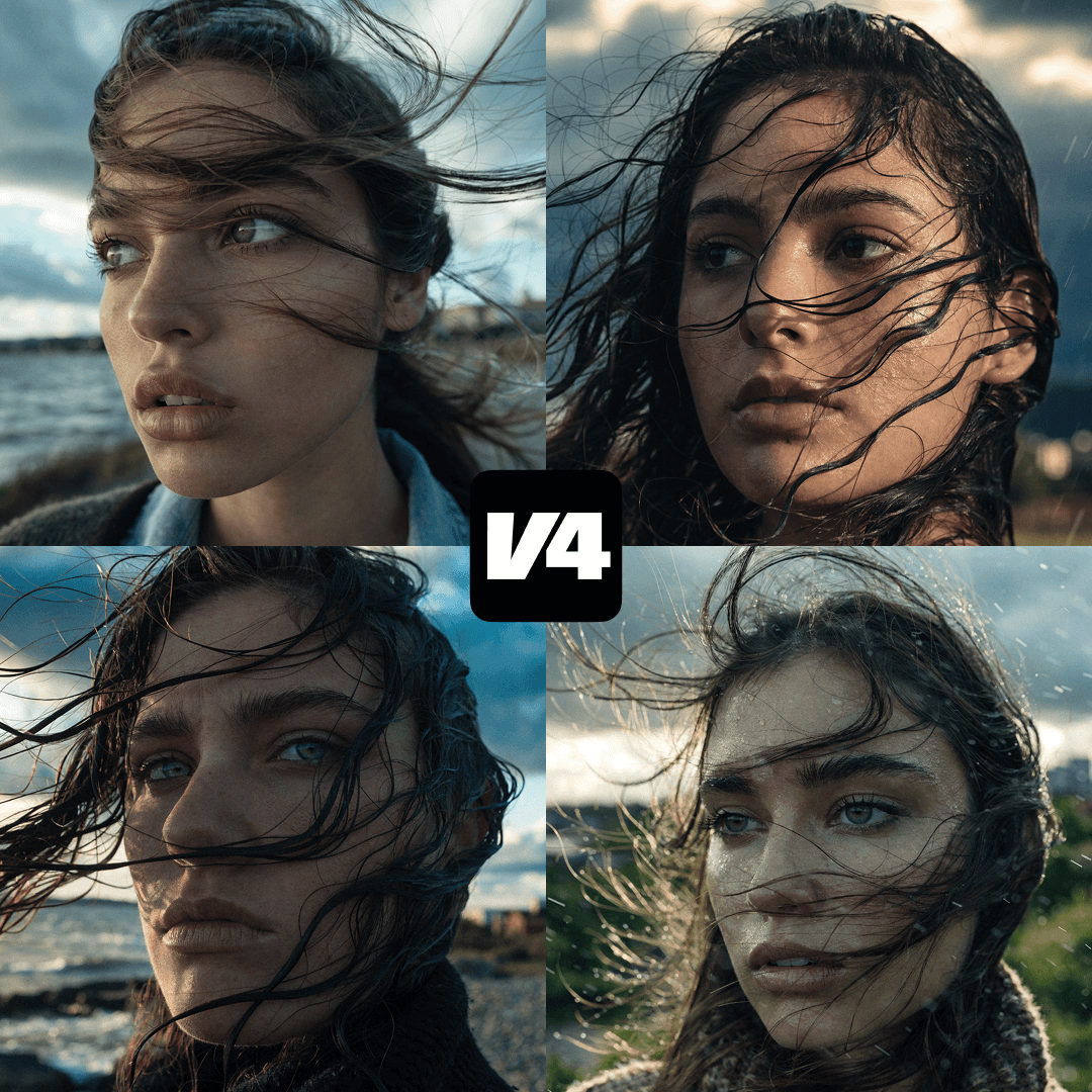
PROMPT (click to expand)
Ultra-close cinematic portrait of a young woman outdoors during windy weather, strands of dark hair blowing dramatically across her face, intense thoughtful gaze directed off-frame, shallow depth of field with blurred natural landscape and distant structures in the background, overcast sky with moody clouds, dynamic movement captured mid-motion, natural skin texture, soft but contrasty color grading with teal and warm highlights, documentary-style realism mixed with editorial fashion photography, handheld camera feel, subtle motion blur in hair, high detail in eyes, atmospheric and introspective mood, golden hour light breaking through clouds, high resolution, filmic grain, dramatic yet intimate composition.
Once again, both models deliver technically accurate results, but with clear differences in atmosphere and visual intent.
V4 Pro
GPT High
Nano Banana Pro
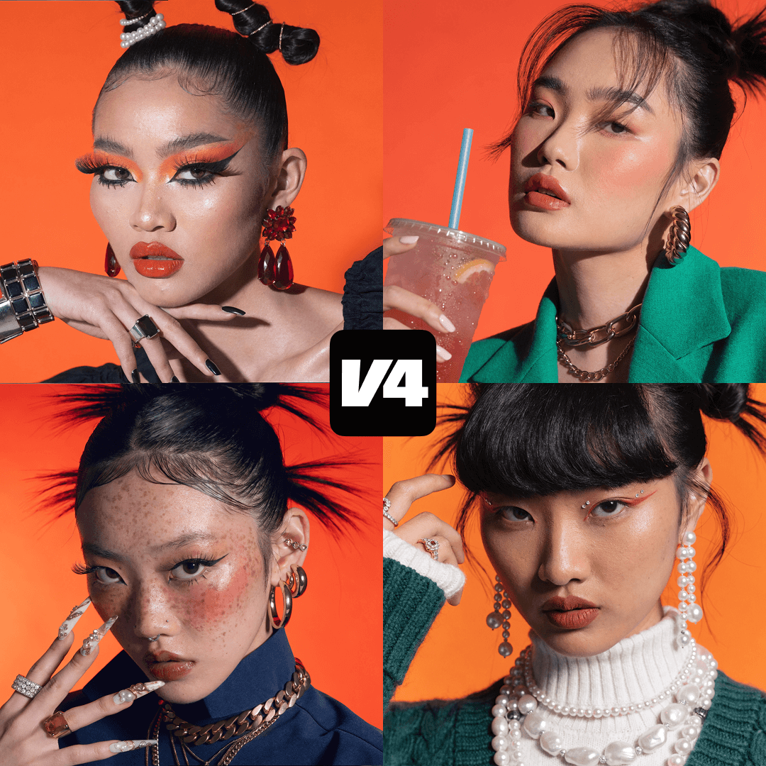
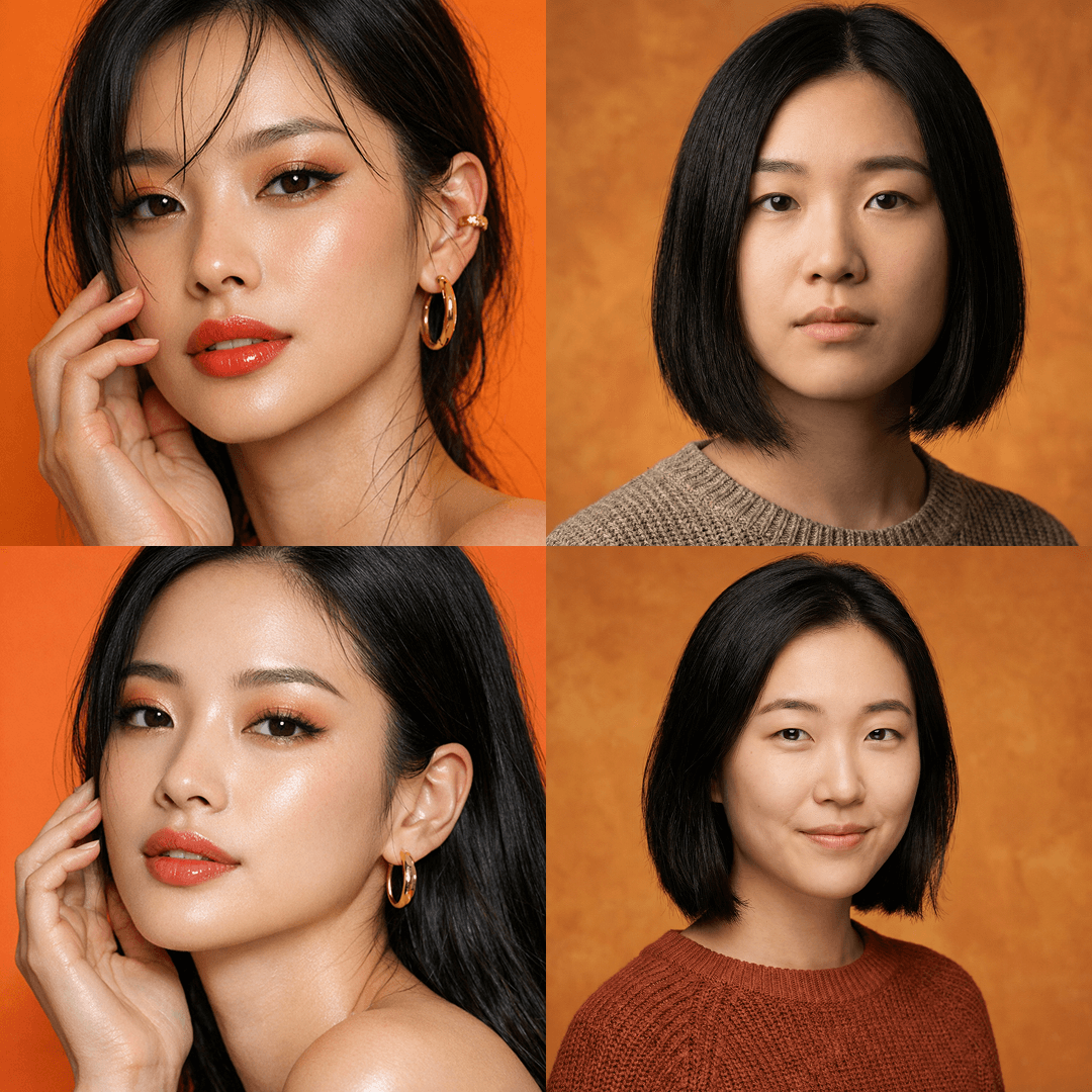
PROMPT
Close up of an Asian model, orange background
We can also use intentionally simple and short prompts. Without giving stylistic cues, lighting direction, or mood description, we can see how image models make their own aesthetic decisions from minimal prompts. V4 delivers images with strong visual identity, intentional styling, expressive makeup, and confident composition. Each frame could find its way into a fashion editorial or campaign.
The other outputs offer clean compositions with proper lighting and accurate facial structure, but they feel neutral and conventional. The styling is safe and the visual language is closer to studio stock than creative direction.
If you're looking for a more editorial-forward result from a simple prompt, V4 is your choice.
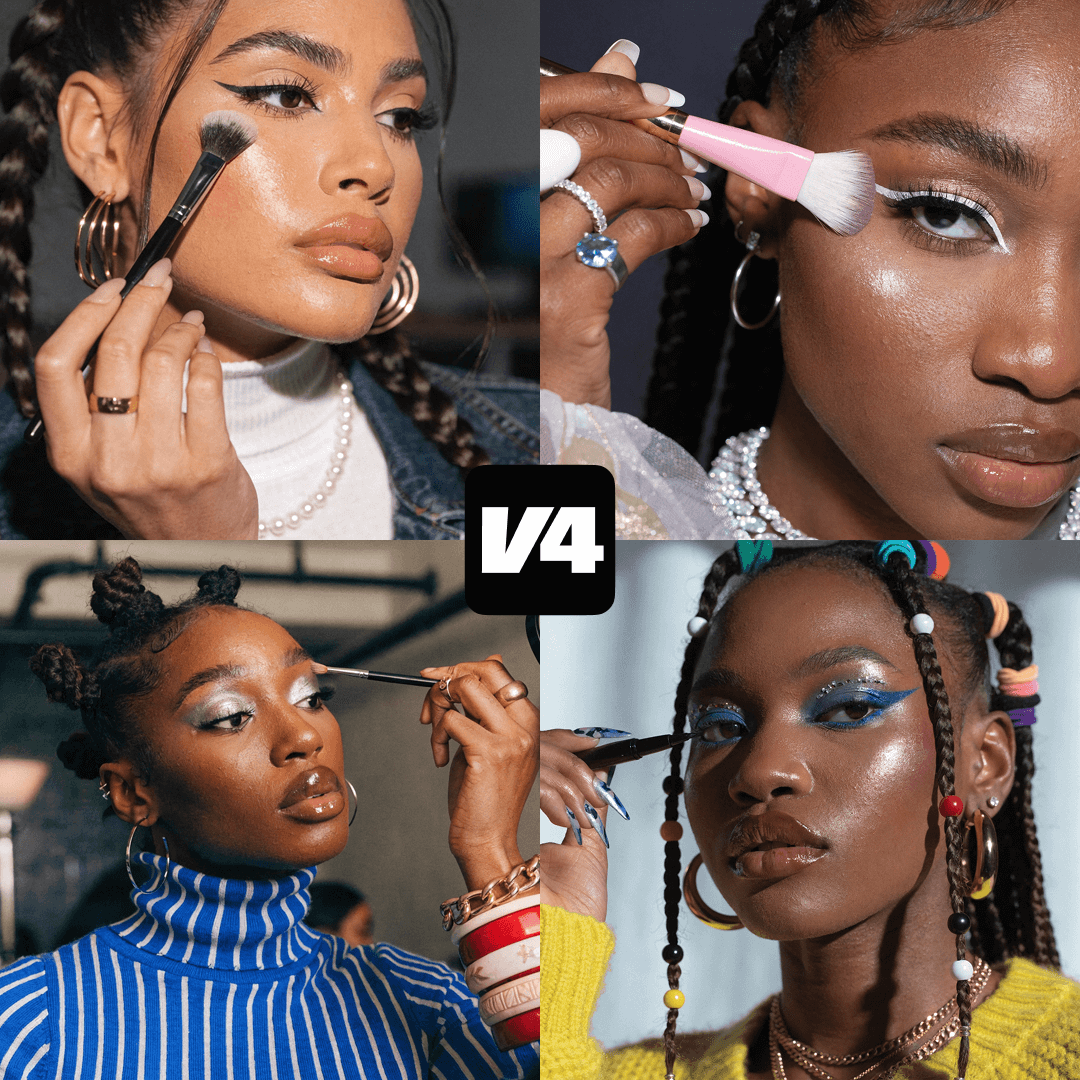
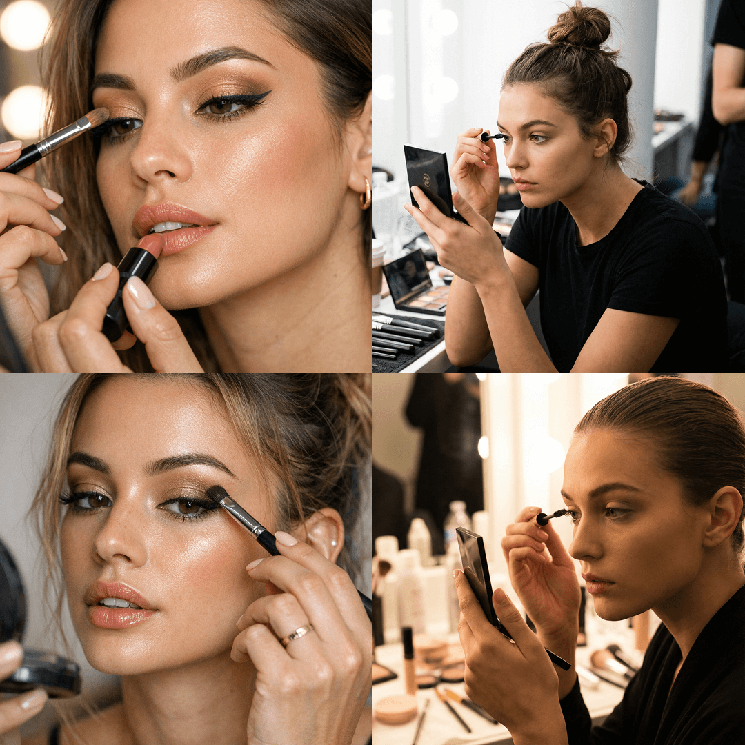
Now let's try another simple prompt but this time introduce an action.
Again, no stylistic cues are in the prompt. What we see in the results is that V4's generations feel like part of a campaign rather than a random backstage moment. Nano Banana understands the same prompt correctly; the dressing room, mirror, cosmetics are logical choices. Visually, it leans toward a neutral backstage or stock aesthetic. The GPT result also follows the prompt accurately, however, the images feel commercially safe and polished rather than creatively directed.
V4 Pro
GPT High
Nano Banana Pro
PROMPT
Close up of a model doing her own makeup
Generating images with text
In many generation scenarios, the output is not just an image, but an image that integrates text or applies a specific typographic treatment. As prompts become more detailed and prescriptive, the space for interpretation narrows: models are expected to follow instructions precisely and resolve complex relationships between form, text, and environment.
These upcoming comparisons illustrate how V4 interprets this level of contextual detail and treats typography as a structural component of the composition rather than a purely decorative overlay, especially when working with long, highly specific prompts that define both visual intent and spatial behavior.
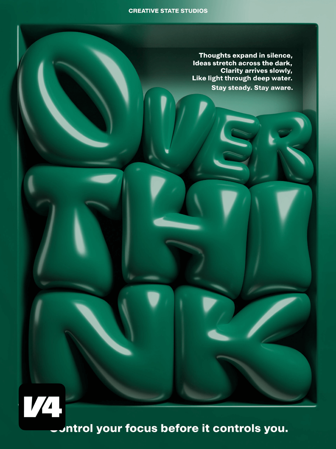
V4 Pro
Nano Banana Pro
PROMPT (click to expand)
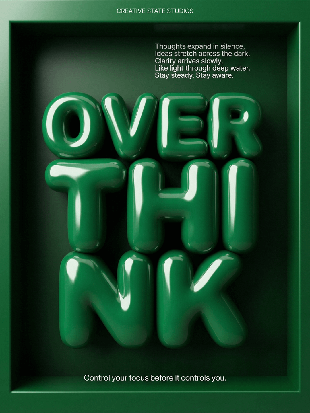
Highly detailed 3D typographic poster in a bold monochrome sculptural aesthetic with a deep framed box composition. Vertical layout with strong depth, dramatic contrast, and strictly typographic overlays only. The entire composition is built inside a deep recessed rectangular frame, like a shadow box, where the inner cavity is darker than the outer border, creating dimensional depth and a sculptural container effect. No decorative icons, no graphic symbols, no line graphics — typography only. The entire poster is rendered in a monochromatic deep emerald green palette: the outer frame is a saturated rich forest green with a smooth satin finish, the inner recessed cavity is a darker pine green with a subtle vignette gradient toward the corners, the 3D letters are glossy lacquered emerald green, slightly brighter than the cavity but within the same tonal range, and all overlay typography is pure flat white. No red, no warm hues, no accent colors — everything remains within a refined green tonal spectrum from dark pine to luminous emerald. The main 3D word reads OVERTHINK, split into staggered stacked sculptural segments arranged vertically as OVER / THI / NK. The letters are thick, inflated, rounded, plush-like, resembling high-gloss vinyl or lacquered balloon plastic, with ultra-smooth surfaces, fully reflective, no seams, no surface noise, and no imperfections. Material is high-gloss enamel polymer in a deep emerald tone with strong specular highlights, clean ray-traced reflections, and perfect curvature. The letters appear slightly compressed inside the cavity, gently pushing toward the frame edges to create tension and spatial pressure. Lighting creates bold highlight streaks across the curved surfaces while maintaining controlled contrast. Secondary typography appears as flat white text only: at the top center in small uppercase reads "CREATIVE STATE STUDIOS"; in the upper right quadrant, a right-aligned paragraph block in clean sans-serif reads "Thoughts expand in silence, Ideas stretch across the dark, Clarity arrives slowly, Like light through deep water. Stay steady. Stay aware."; and at the bottom, full width and centered, reads "Control your focus before it controls you." All secondary typography is clean modern sans-serif, flat white, with no shadow, no glow, no outline, perfectly sharp and minimal. Lighting is directional studio lighting from the upper left, producing strong glossy highlights on the 3D letters, a slightly darker inner cavity for depth, and soft shadowing where letters approach the frame edges, with no dramatic rim light and no additional visual elements. Rendering style is ultra-clean CGI with physically based rendering, ray-traced reflections on letters only, soft global illumination, no texture maps, no surface grain, no noise, 8K resolution, minimal brutalist editorial poster aesthetic, monochrome sculptural mood, and a bold, tense, modern atmosphere
Both models correctly render the prompt with both the short and long text blocks. The typographic treatment on the left is executed with greater precision and conceptual clarity. The prompt explicitly describes letters "compressed inside the cavity, pushing toward the frame edges." V4 follows this instruction literally and works with the context, not just the surface style.
As a result, we see not simply inflated letterforms, but a compositional interpretation where the typography actively deforms, presses against the frame, and creates real spatial tension. The effect is justified by the structure of the layout.
In Nano Banana's result, the letters are inflated but remain centered and self-contained. They do not interact with the frame or the surrounding space.This distinction significantly affects the final perception: Recraft shows design taste by making the letters interact with space, not just exist within it.
V4 Pro
Nano Banana Pro
PROMPT (click to expand)
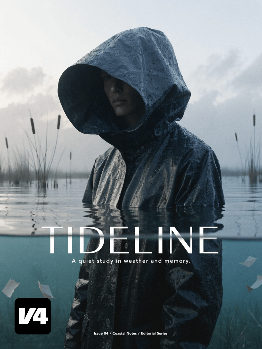
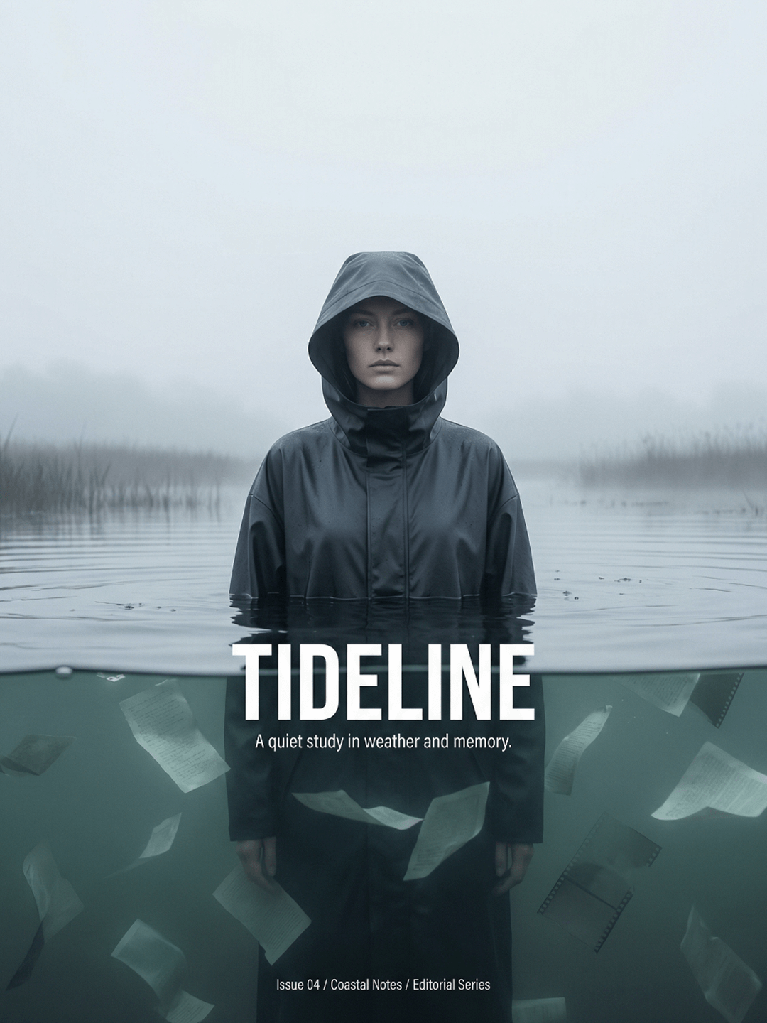
A high-end editorial fashion poster with cinematic realism and a quiet, haunting mood. The composition is portrait-oriented with generous negative space and a strong central subject, evoking a luxury magazine cover through minimal, bold typography, controlled color grading, and a single subtle surreal twist. The scene is set at a foggy coastal salt marsh at dawn, not open water: a pale overcast sky, soft mist, distant reeds, and a faint horizon line create a damp, cold atmosphere with low contrast and gentle haze. No fish and no aquarium feel. A lone figure wearing a matte charcoal hooded raincoat stands chest-deep in still marsh water, with only the head and upper shoulders visible. The hood is large and sculptural, partially shadowing the face, which has a calm, neutral, introspective expression. The waterline cuts perfectly horizontally across the frame, with realistic surface tension and tiny ripples. The raincoat fabric appears wet, with soft highlights and small creases, styled as premium outerwear editorial fashion. Beneath the water surface, instead of fish, float minimal pale paper-like fragments resembling torn journal pages or thin translucent film strips, drifting slowly and catching light softly to create a quiet visual rhythm; the effect is subtle, elegant, and uncluttered. Color grading is cool and muted, using slate gray, deep blue-black, desaturated sea-green, and pale fog-white tones, with very restrained contrast. Skin tones remain natural but slightly cool. Lighting is diffused dawn light with soft specular reflections along the waterline and no dramatic spotlights. Typography uses a bold, modern condensed sans-serif for the main title, placed centered across the waterline to bridge both above-water and below-water areas. The main title reads "TIDELINE" in all caps, with a small subtitle beneath in a thin, spaced sans-serif reading "A quiet study in weather and memory." Additional micro-copy appears in small type near a bottom corner reading "Issue 04 / Coastal Notes / Editorial Series." Typography is clean and premium, with tight kerning on the main title, generous tracking on smaller text, perfect alignment, no decorative effects, and white text only, optically balanced against the dark coat.
In this comparison, both models correctly interpret the prompt and successfully construct the core scene: a solitary figure in water, restrained mood, editorial framing, and integrated typography. The task is understood at a structural level on both sides.
The difference emerges in how context is resolved and layered. In the V4 result, typography is not simply placed on top of the image, but becomes part of the environment. The title interacts with the waterline, visually bridging the above-water and below-water space, reinforcing the central concept rather than sitting as an overlay.
V4 demonstrates contextual awareness and design taste by treating typography, lighting, and space as a single system.
V4 Pro
Nano Banana Pro
PROMPT (click to expand)
contemporary experimental portfolio cover poster built around the concept of optical diffusion and perception, with a modern, refined, and minimal editorial, design-forward, gallery-grade aesthetic that combines clean typography with a strong material illusion effect. The composition features a single standing figure photographed in soft natural daylight, positioned slightly off-center, wearing a simple deep charcoal coat with a high collar, a neutral and confident expression, and a direct gaze. The entire image is viewed through a textured translucent surface resembling architectural privacy glass, with organic, irregular distortion rather than uniform blur, creating a granular diffusion pattern that breaks the image into tiny refracted shapes while keeping the eyes faintly visible and sharp enough to anchor the composition; the glass effect is strongest in the center and gradually fades toward one vertical edge with a smooth, atmospheric, tactile transition and no harsh masking. The background is a clean, minimal outdoor setting with a soft sky gradient blending pale desaturated blue into warm sand beige, with no visible landscape details, only subtle color blocks suggesting depth. The color palette includes pale sky blue, warm sand beige, deep charcoal clothing, warm natural skin tones, and crisp white typography, maintaining high contrast while remaining soft and calm with no saturated colors. Typography follows a refined, intentional hierarchy: top left small uppercase sans-serif with slight tracking reading "FIELD STUDIES," top right vertical thin sans-serif reading "PORTFOLIO 2026," left mid-level a large number "02," center overlay medium-weight sans-serif with spaced letters reading "OPTICAL VEIL," below it smaller text reading "Explorations in material illusion and layered perception," bottom left a small thin-weight paragraph reading "A curated selection of visual systems, interface experiments, and spatial graphics investigating clarity, distortion, and presence," and bottom right very small right-aligned text reading "Studio Archive — Edition B." All typography is white, placed cleanly above the distorted surface with careful spacing and alignment, no drop shadows, no boxes, no borders, no logos, no instructional text, generous margins, strong vertical balance, portrait orientation, minimal elements, and the feel of a contemporary design annual cover with editorial minimalism, translucent glass distortion, architectural diffusion, optical texture overlay, atmospheric softness, and calm composition.
In the prompt it was explicitly described as a poster, and the V4 output functions as a complete, production-ready poster that can be used directly in mockups, print, or digital layouts. The optical diffusion effect is central to the composition and integrated into the visual system, not applied as a secondary treatment.
The Nano Banana image, in contrast, reads more like a framed art object or presentation shot, which introduces ambiguity about its intended use and makes it less suitable as a production-ready poster.
Describe what you want and actually get it
V4 really understands what you mean when you prompt an image. Whether your prompt is simple or deeply descriptive, the model keeps the whole composition consistent from start to finish. What you describe is what you see.
When a prompt moves beyond a single image and becomes a production task — like generating multiple product mockups — accuracy alone isn't enough. The model needs to preserve structure, composition, and intent across every variation.
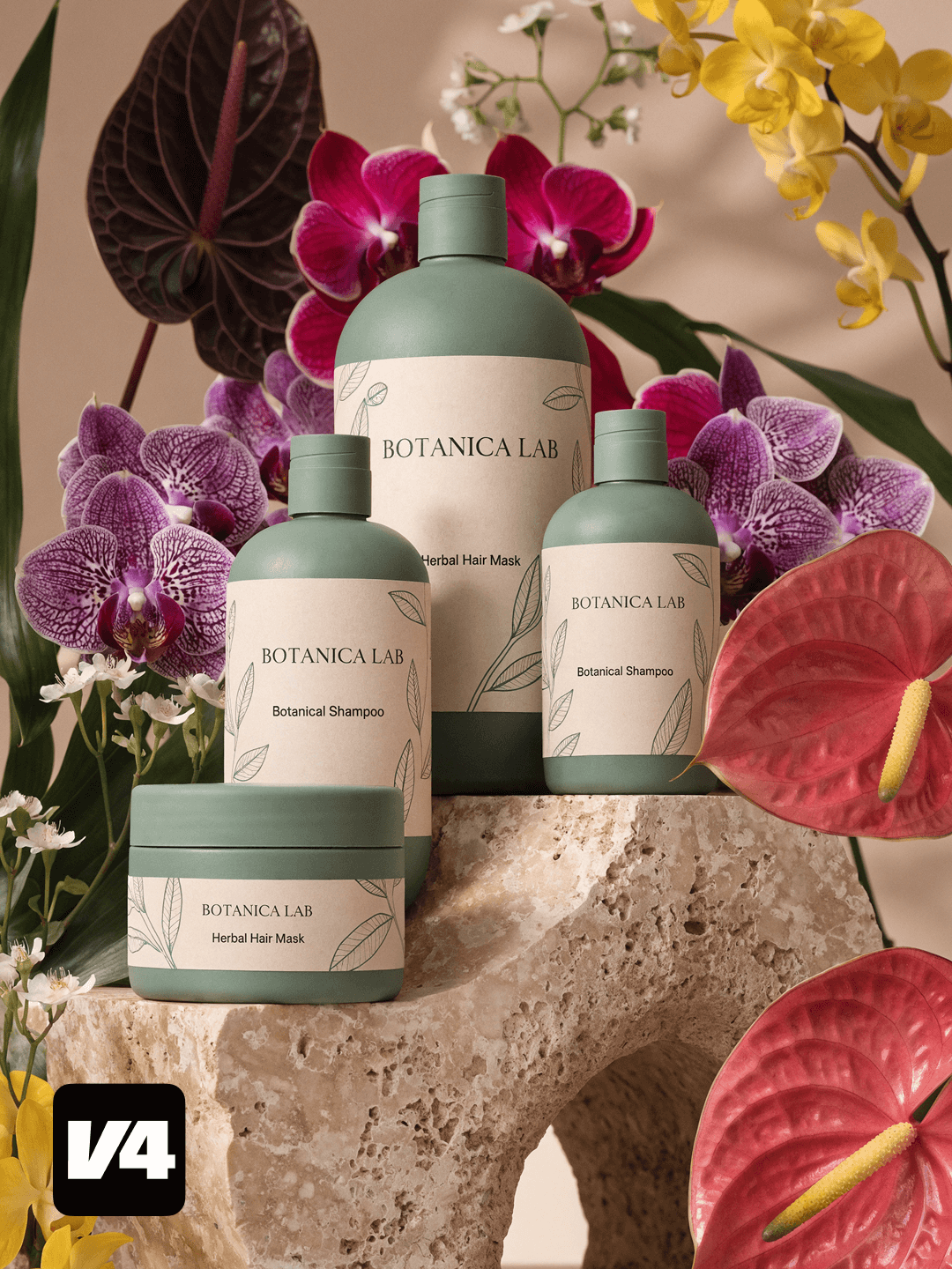
V4 Pro
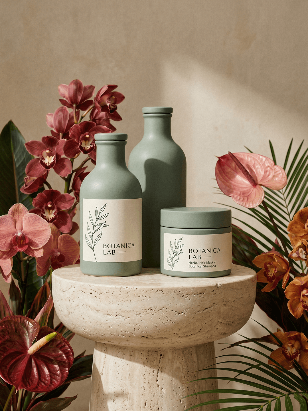
Nano Banana Pro
PROMPT (click to expand)
High-end studio product photography of three matte sage-green bottles and one matching jar with minimalist cream labels. The front label features refined botanical line illustrations and the text: "BOTANICA LAB — Herbal Hair Mask / Botanical Shampoo." The products are arranged on a sculptural travertine pedestal against a warm neutral backdrop. Lush exotic flowers such as orchids and anthuriums surround the composition, adding vibrant color accents and a sophisticated tropical mood. Soft diffused natural light creates gentle shadows and subtle highlights, enhancing texture and emphasizing the premium, modern wellness aesthetic.
The prompt explicitly asked for "three matte sage-green bottles and one matching jar" with clear branding on each product. Recraft V4 Pro follows these requirements precisely, delivering the correct product set with consistent labels and logos, making the image ready for real production use. Nano Banana Pro generates an incorrect number of products and misses branding on one of the bottles, breaking prompt accuracy.
Product shots
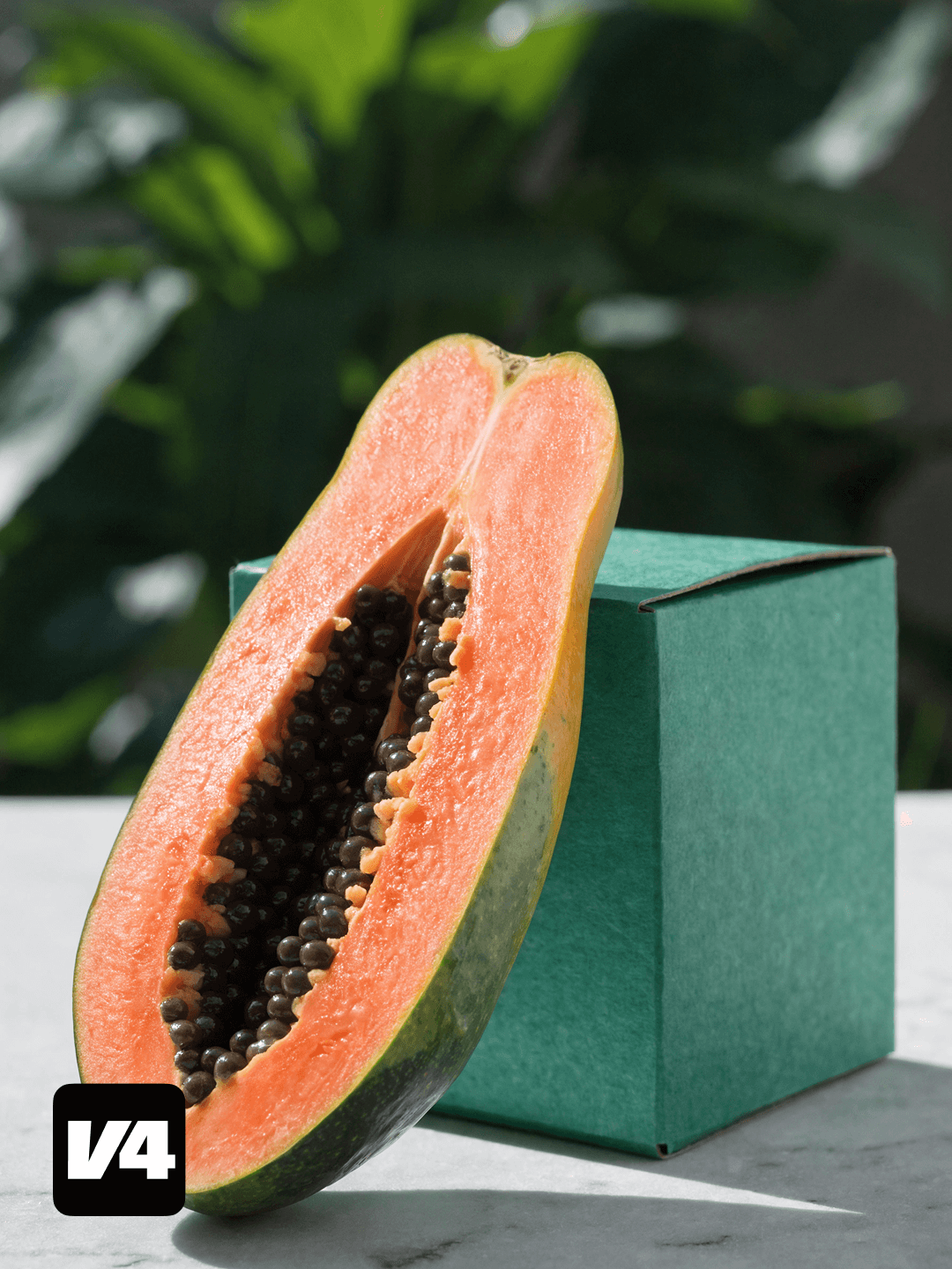
In this comparison, pay attention to compositional control. Recraft V4clearly identifies the papaya and the box as the primary subjects and keeps them visually dominant throughout the frame. Both elements are well-centered, properly balanced, and clearly framed, which preserves the intended hierarchy of the composition.
V4 Pro
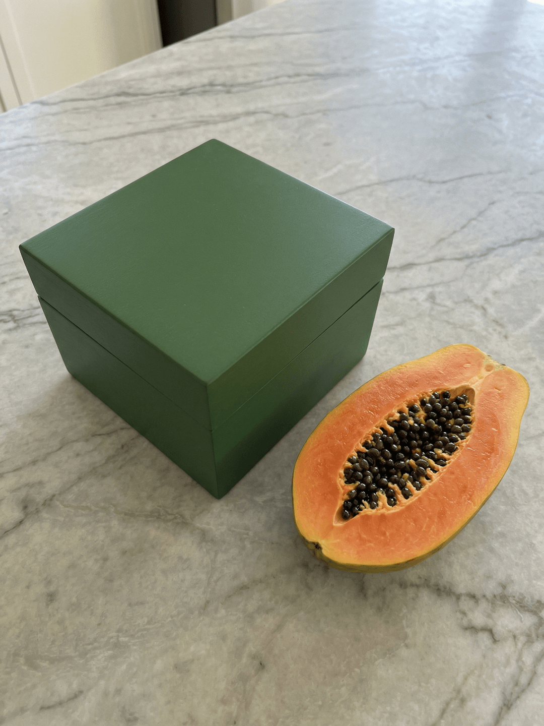
Nano Banana Pro
PROMPT (click to expand)
A square green box with a smooth matte finish is placed beside a freshly sliced papaya cut in half, revealing its vibrant orange flesh and glossy black seeds. The rich tropical tones of the fruit contrast beautifully with the deep green surface of the box. Both objects rest on a light stone or marble surface, creating a clean, balanced composition that highlights their shapes, textures, and color contrast.
The image on the right is correct but suffers from weaker framing. The main objects are cropped awkwardly, the visual center is less defined, and the composition feels incidental rather than intentional. As a result, the scene reads more like a casual photograph than a designed visual asset. V4 demonstrates stronger design judgment by maintaining focus, hierarchy, and clarity — essential qualities for production-ready visuals.
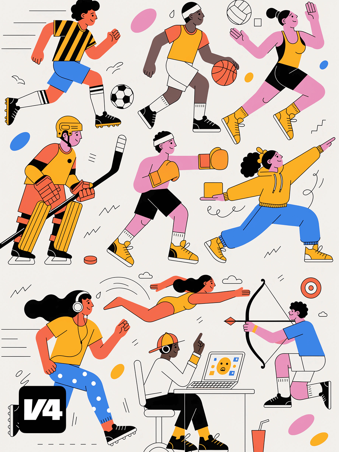
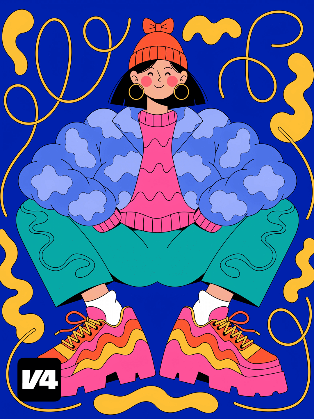
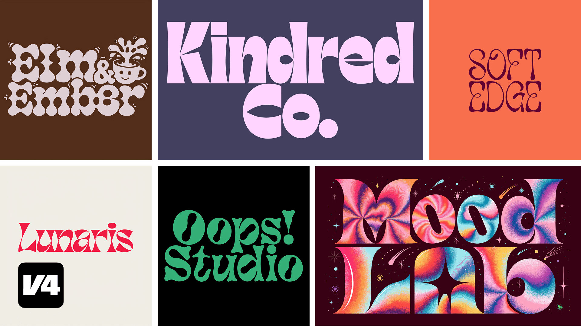
Recraft V4 Vector and V4 Pro Vector models
Recraft is the only AI model that generates editable vector files from a prompt. These are actual SVGs files with structured layers and clean geometry, ready to export for web or print or open in any other professional design tool for further editing. V4's vector output is built for production use: brand assets, illustrations, icons, and product design elements, with no tracing, cleanup, or conversion steps required.
Production-ready outputs
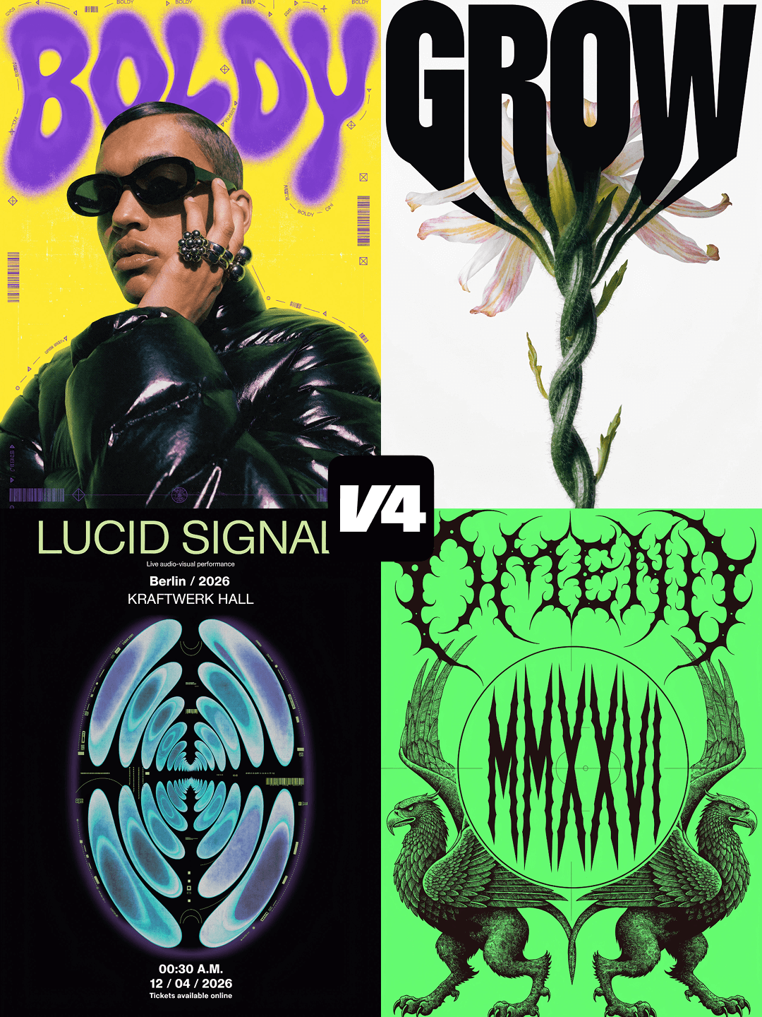
Posters and billboards
Beyond vectors, Recraft V4 generates a wide range of production-ready visuals from a single prompt across digital, print, and brand systems. Each output is designed to be usable, not just visually correct.
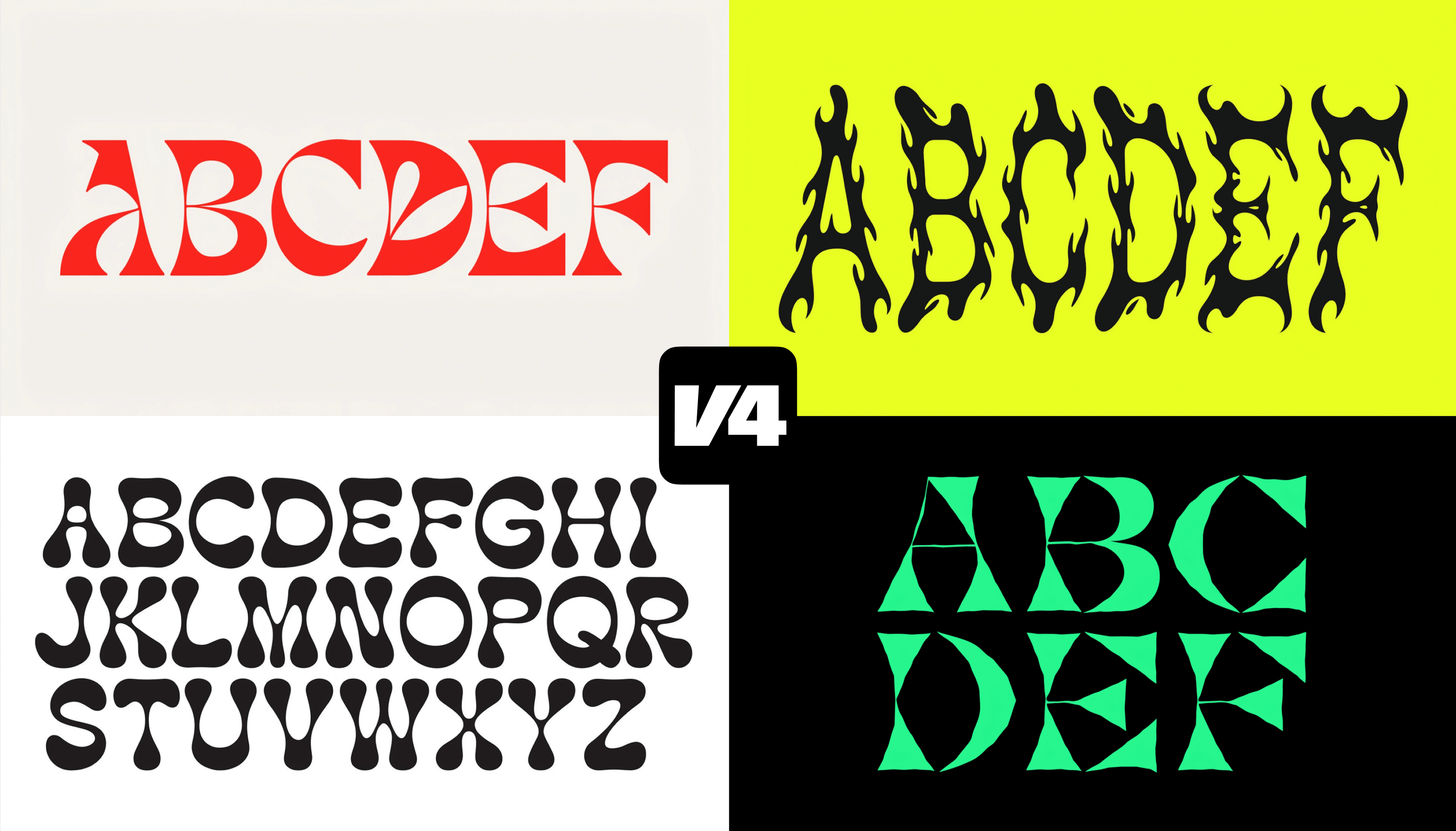
Typography
Logos
Try V4 in Recraft Studio
V4 comes in Standard (1024×1024), Pro (2048×2048), Vector, and Vector Pro versions. V4 Pro delivers noticeably finer detail, improved structure, and higher realism for print and large-scale work. All versions are available to every user, including Free plan users. Recraft V4 is available now in the Recraft Studio and API.
Every user, including Free plan users, gets access to the full model family: Standard, Pro, Vector, and Vector Pro.


.png)
.png)

.png)
.png)